headacy
digital therapy for migraine
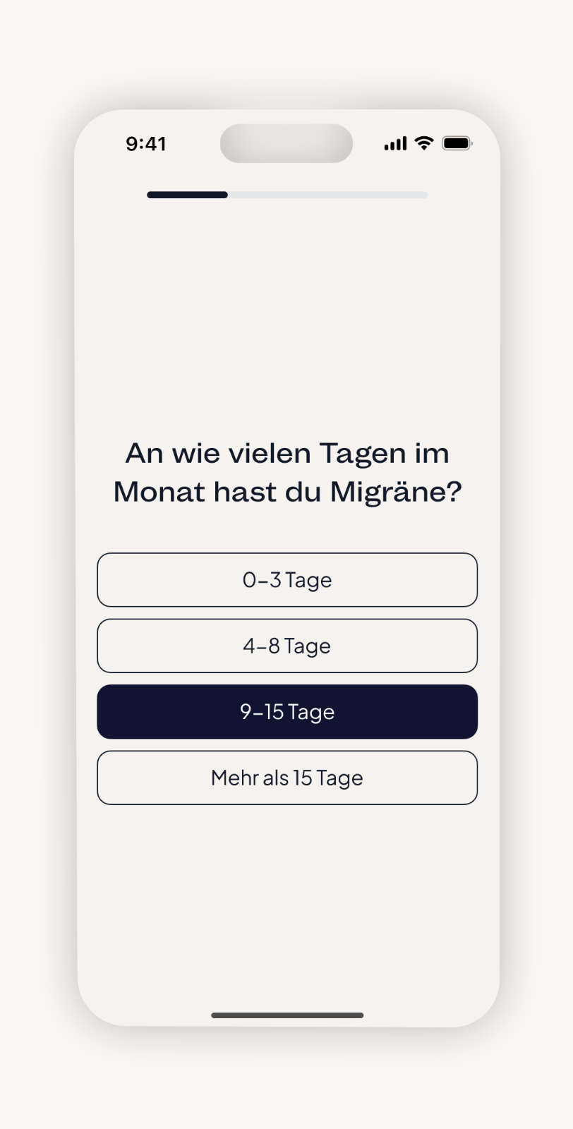
headacy is a digital migraine therapy that empowers users through self-awareness, habit tracking, and gentle behavioral support. Combining medical expertise, cognitive techniques, and relaxation exercises, it helps users manage their condition beyond medication at their own pace.
Client:
tame GmbH
Role:
I led the complete design process for headacy, shaping the concept, brand identity, UX/UI, and illustrations in close collaboration with the founding team, medical experts, researchers, therapists, and developers.

The challenge
The challenge was to create a trustworthy and modern brand with an intuitive user experience that goes beyond symptom relief. It needed to provide holistic support, guide users with clarity and compassion, and empower them to manage their daily lives with migraine more effectively.
The goal
- Create a cohesive identity and app experience that feel calm, modern, and reliable across all touchpoints.
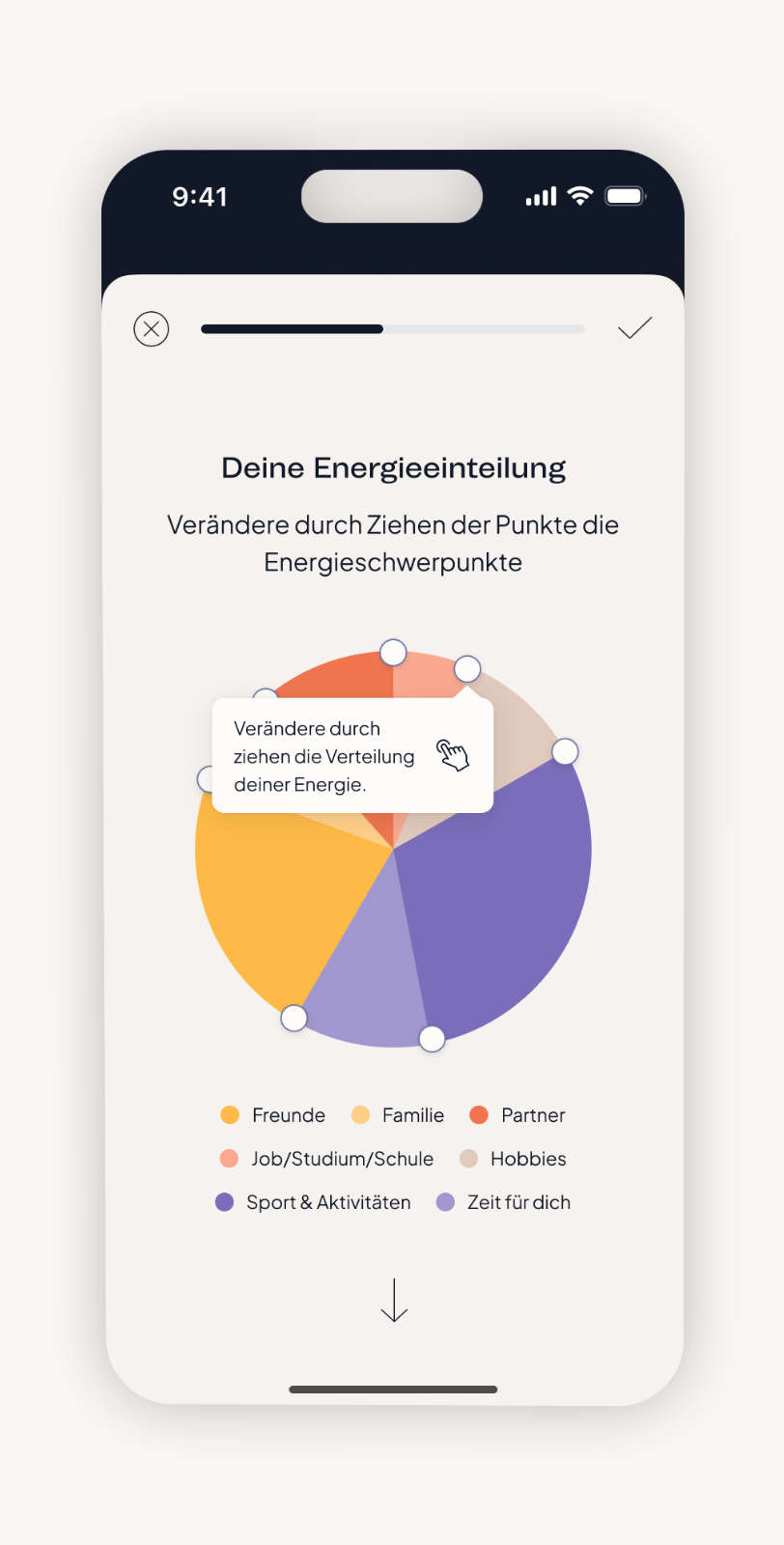
- Translate the brand’s values into a simple, supportive interface that guides users through tracking, insights, and therapy content.
- Use branding and app design together to help people understand their migraine patterns and feel supported in daily self management.


The approach
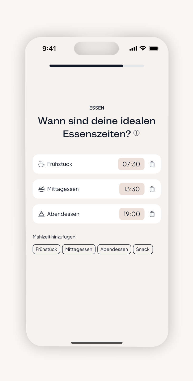
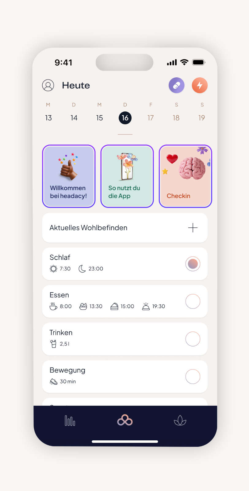
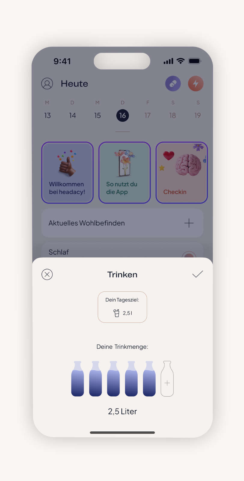
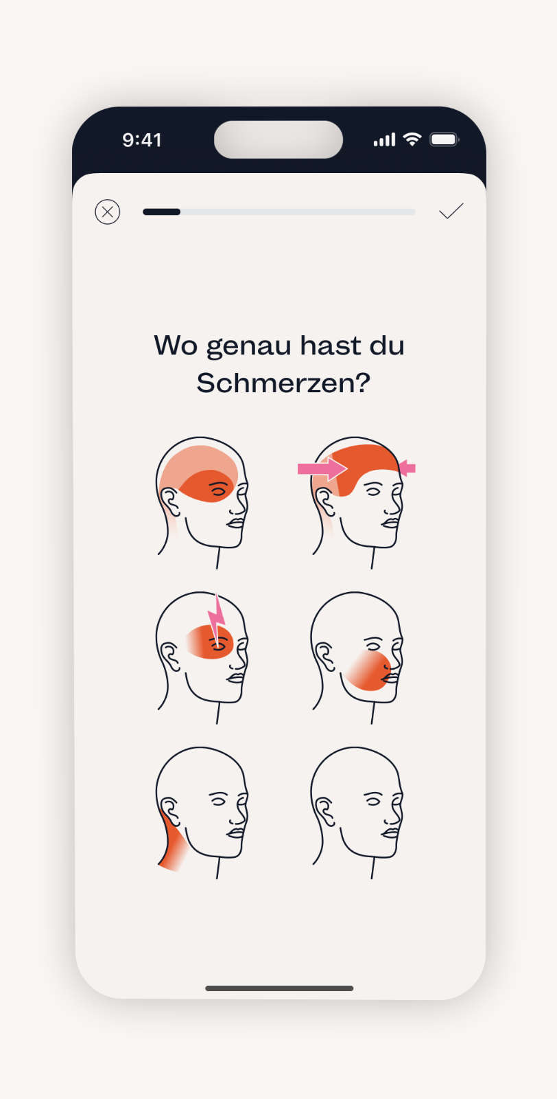
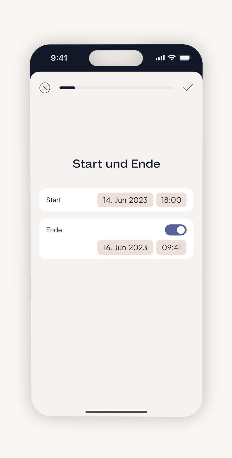
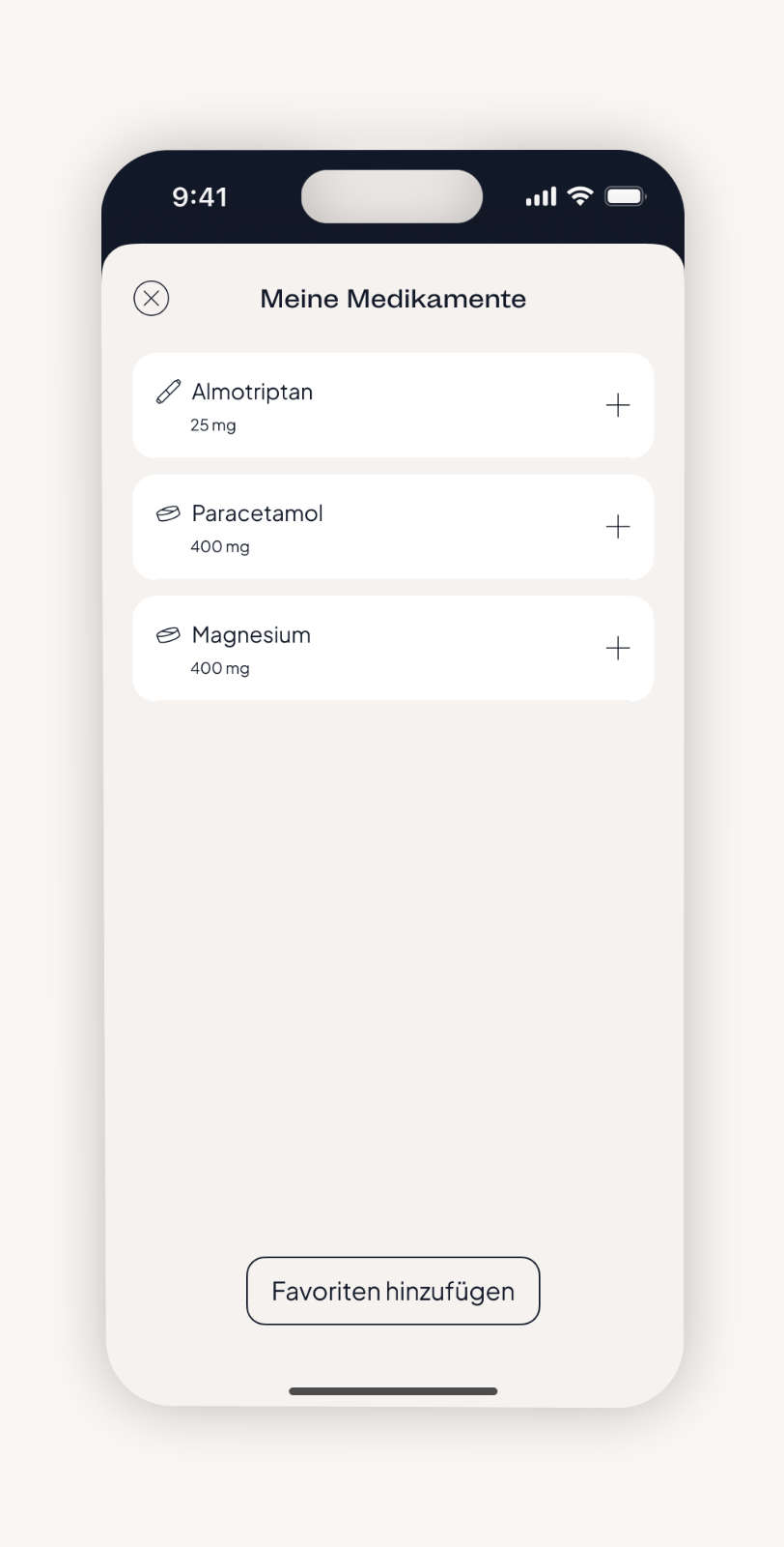
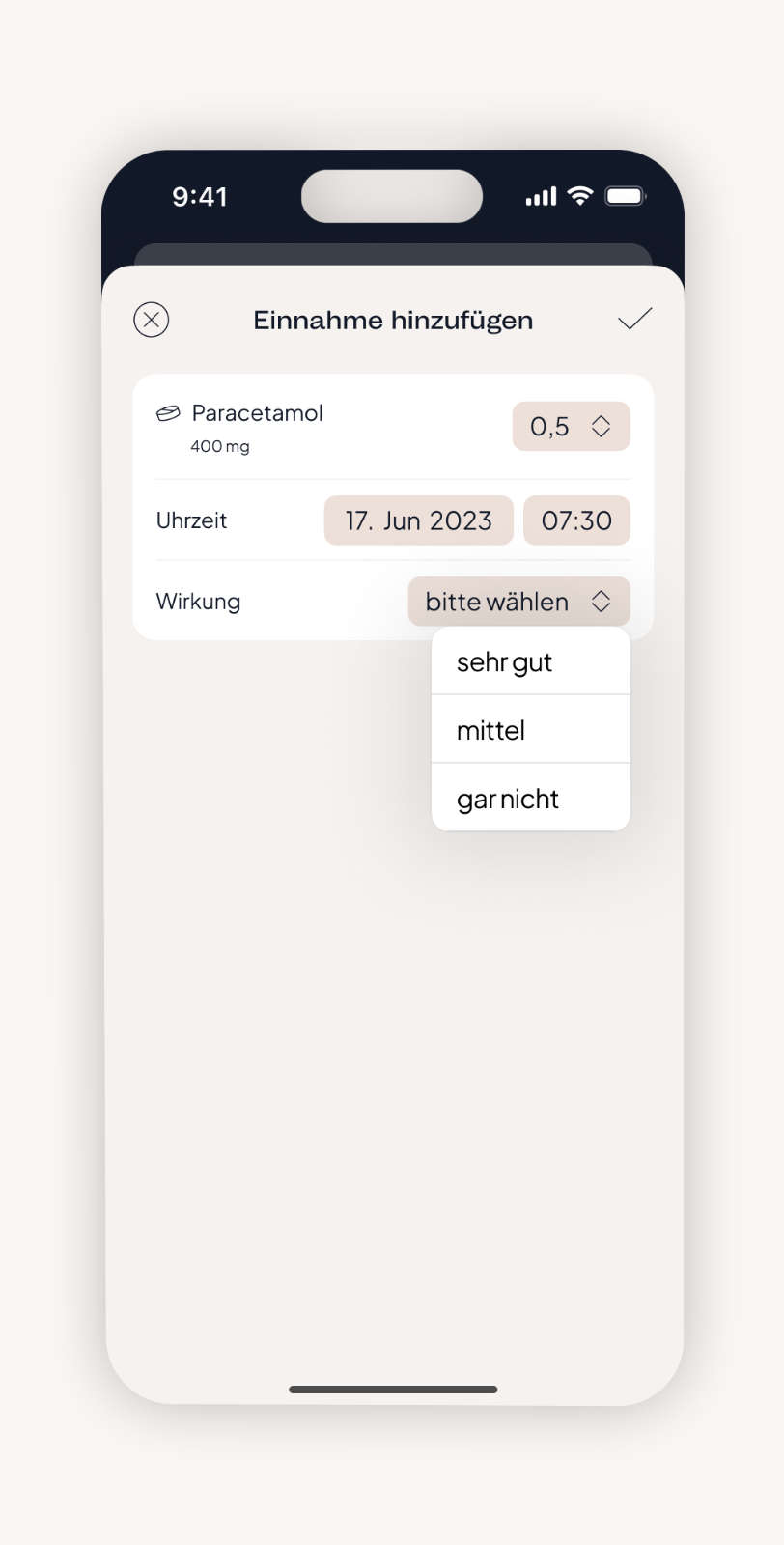
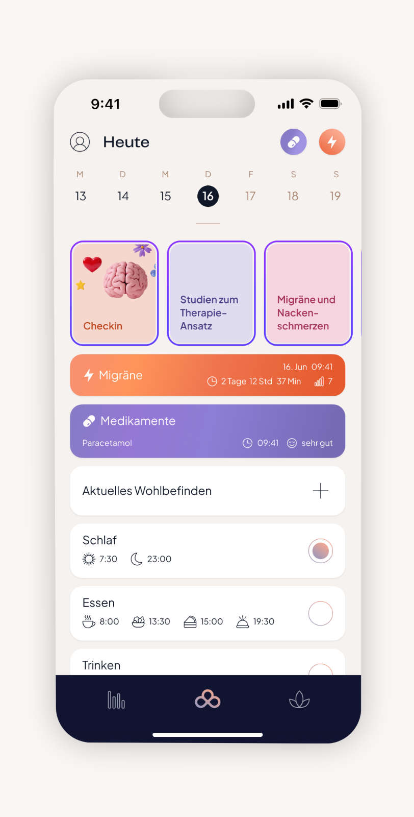
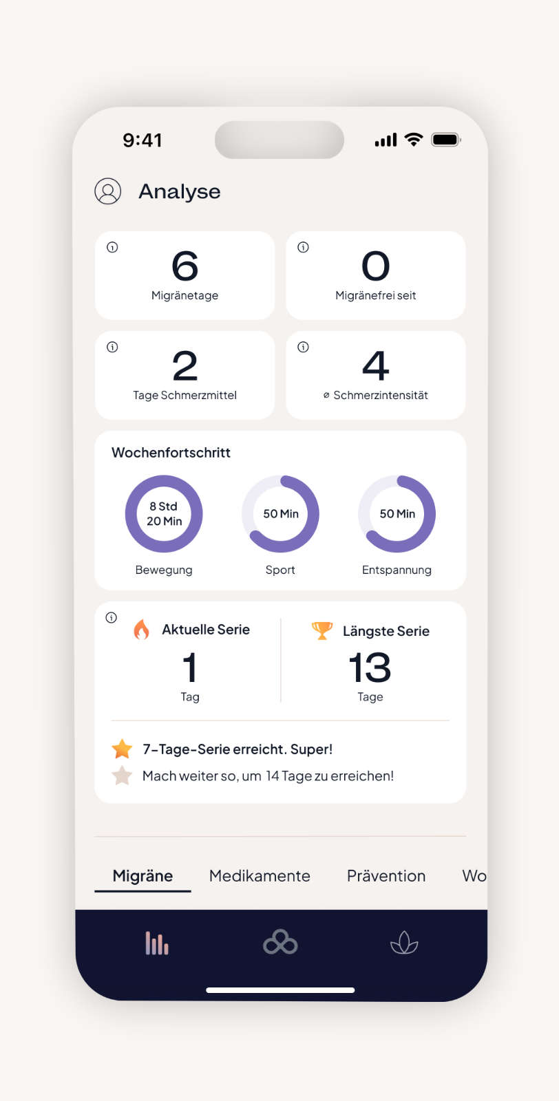
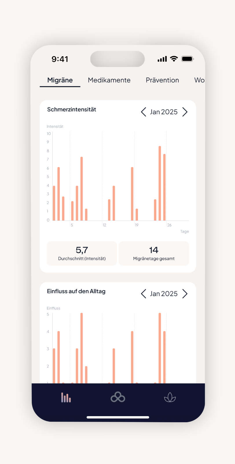
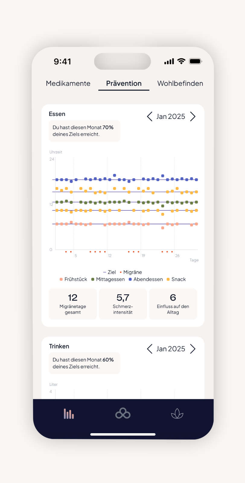
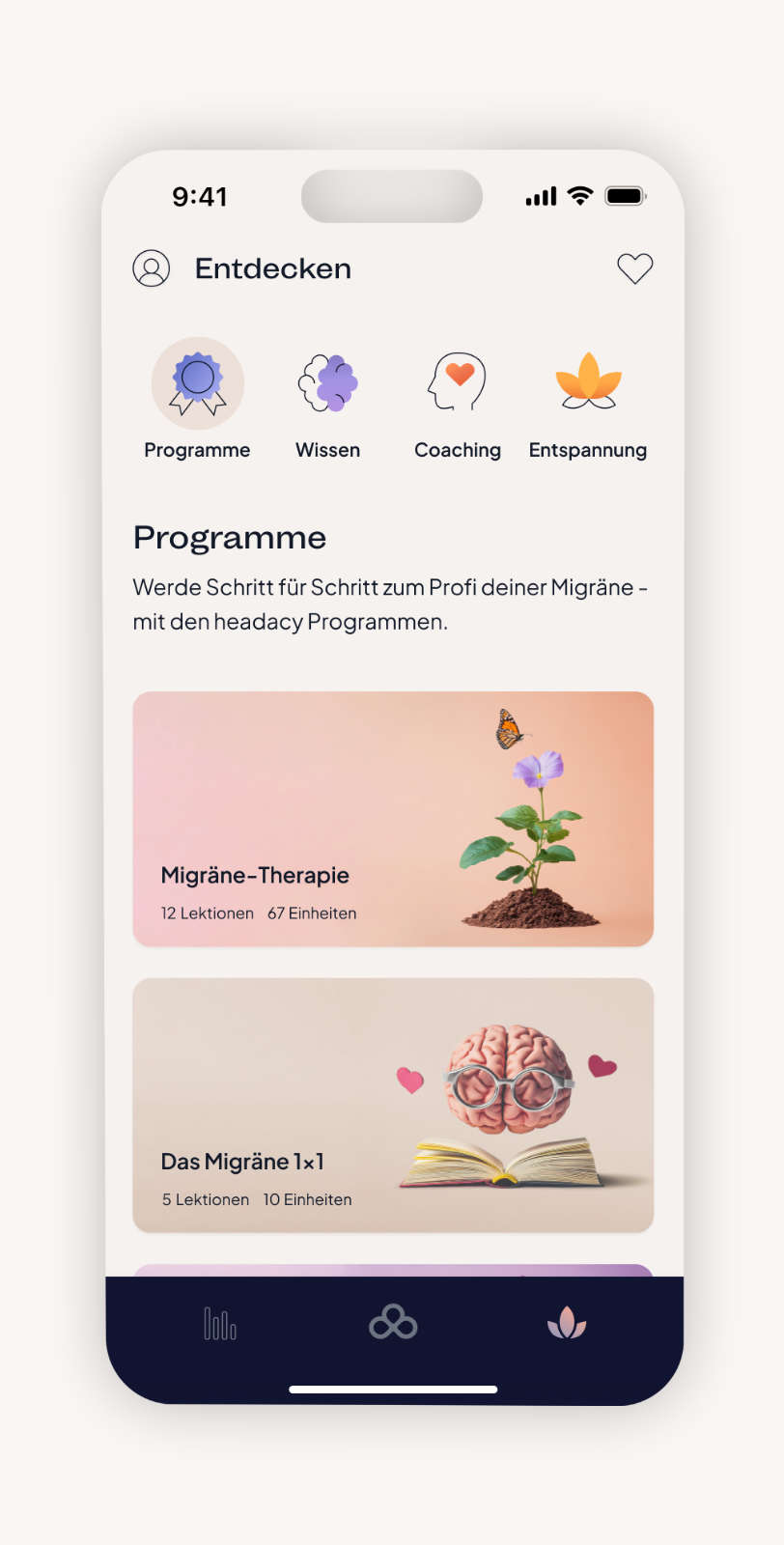
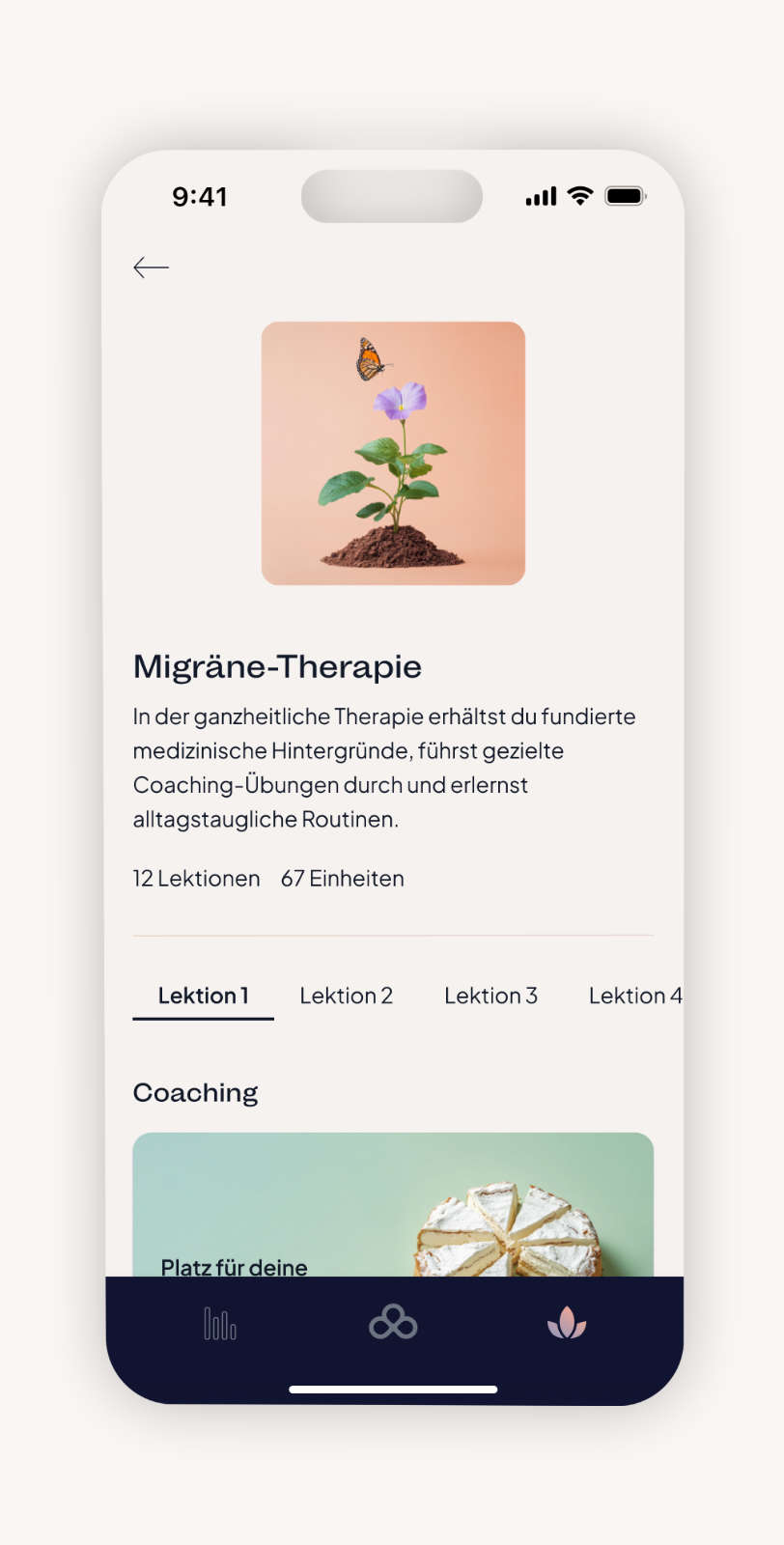
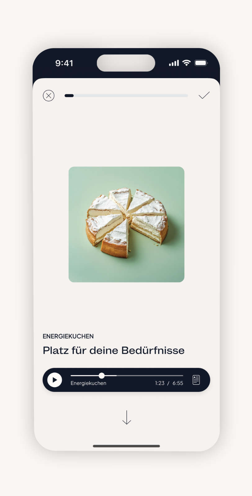
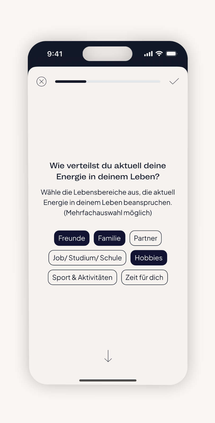
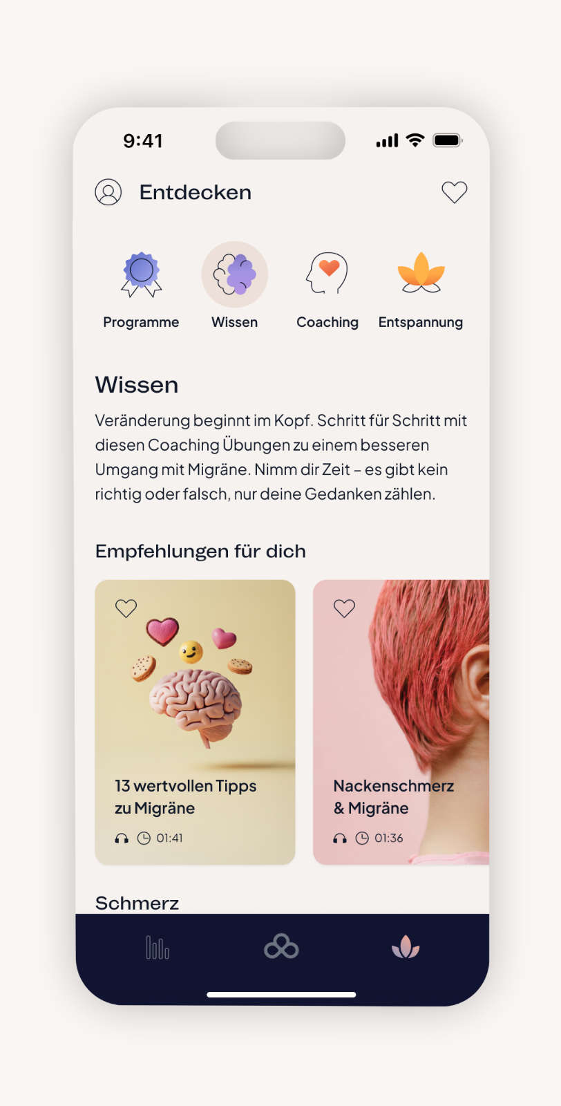
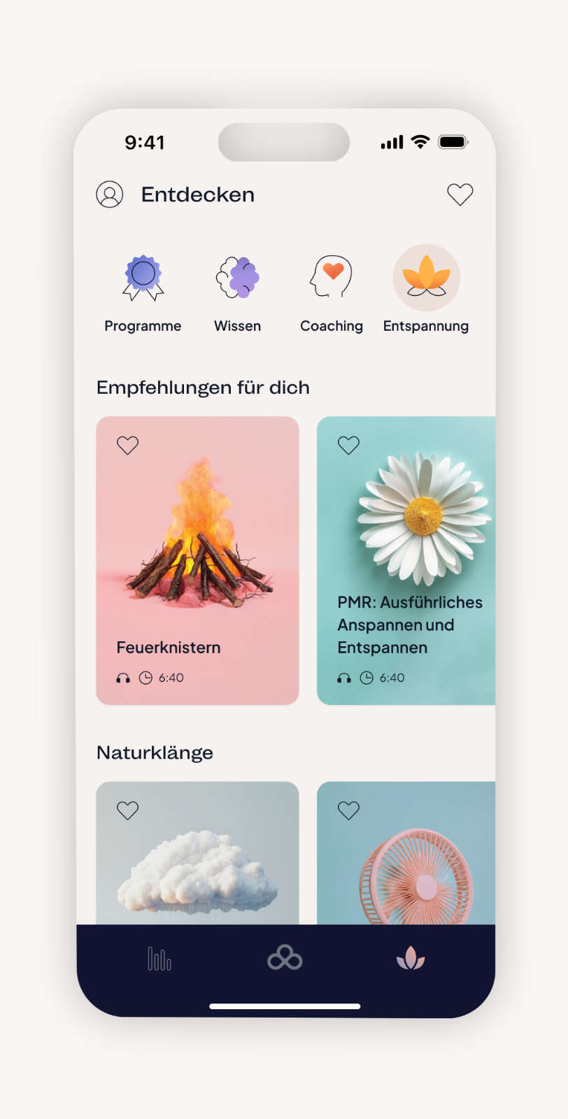
The concept connects a warm, trustworthy identity with an ecosystem designed for clarity and support across app and website. The brand sets the emotional tone by conveying expertise, calm, and empathy, while both platforms translate these values into practical guidance. Through habit tracking, personalised insights, structured therapeutic content in the app, and accessible information on the website, headacy helps users understand their patterns, build confidence, and navigate migraine with more ease.

Logo & typography
The company name headacy merges head and pharmacy, expressing a shift toward active self management and positioning the brand as a supportive digital companion.
The logo, inspired by the trefoil, embodies this idea through three interconnected shapes that represent the core pillars of the therapy approach: cognitive behavioral methods, medical education, and mindfulness. Together, they signal a holistic and natural path toward relief. Mint Grotesk completes the identity with a clear, contemporary tone. Its geometric warmth brings precision and approachability, reinforcing a brand that aims to feel modern, trustworthy, and calm.

Colors
The palette combines calm neutrals with deep, reassuring tones. Soft accents add warmth and gentle energy, supporting an overall atmosphere that feels balanced, supportive, and easy to engage with.

Visuals
The illustrations and visuals are colorful, accessible, and inviting, reinforcing themes of relaxation, reflection, and health awareness. A blend of illustrations and 3D images brings a sense of playfulness to a serious topic.

Social media
Social media, especially Instagram, is used as an extension of the brand experience. Through clear visuals, educational content, and a calm, empathetic tone, headacy shares knowledge, builds trust, and supports people with migraine beyond the app.

Impact
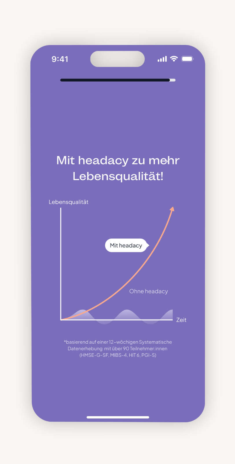
With headacy, users receive a daily companion that goes far beyond symptom management. Through continuous tracking and meaningful analysis, they recognize personal patterns and can make targeted lifestyle adjustments. This builds awareness, strengthens self-efficacy, and provides real value in everyday life with migraine.
20.000 +
Nutzer:innen
4.8
Sterne im App Store
6.800 +
Instagram Follower:innen