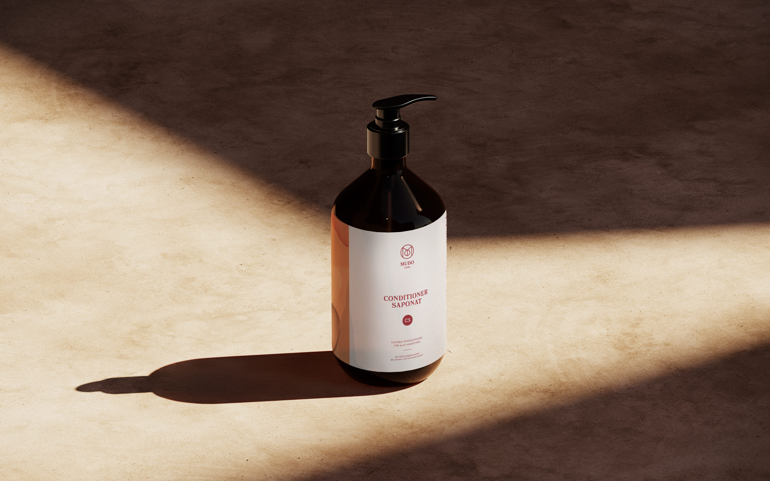
MUDOCARE
MUDOCARE is a family-founded brand from Germany, dedicated to addressing scalp and hair health through natural, sustainable, and effective care. With over 20 years of experience, MUDOCARE offers a range of hair and scalp care products rooted in a holistic approach. Their formulations are crafted with high-quality botanical extracts and oils, consciously avoiding synthetic additives like parabens, silicones, and artificial fragrances. This commitment ensures gentle yet effective care for sensitive scalps.
Client:
MUDOCARE GbR
Role:
Concept, Branding, Packaging, Website
Task:
Development of brand identity, packaging, and website for a care brand that brings together nature, science, and gentle routines for a healthier scalp.
Clarity, calm, and
a touch of warmth
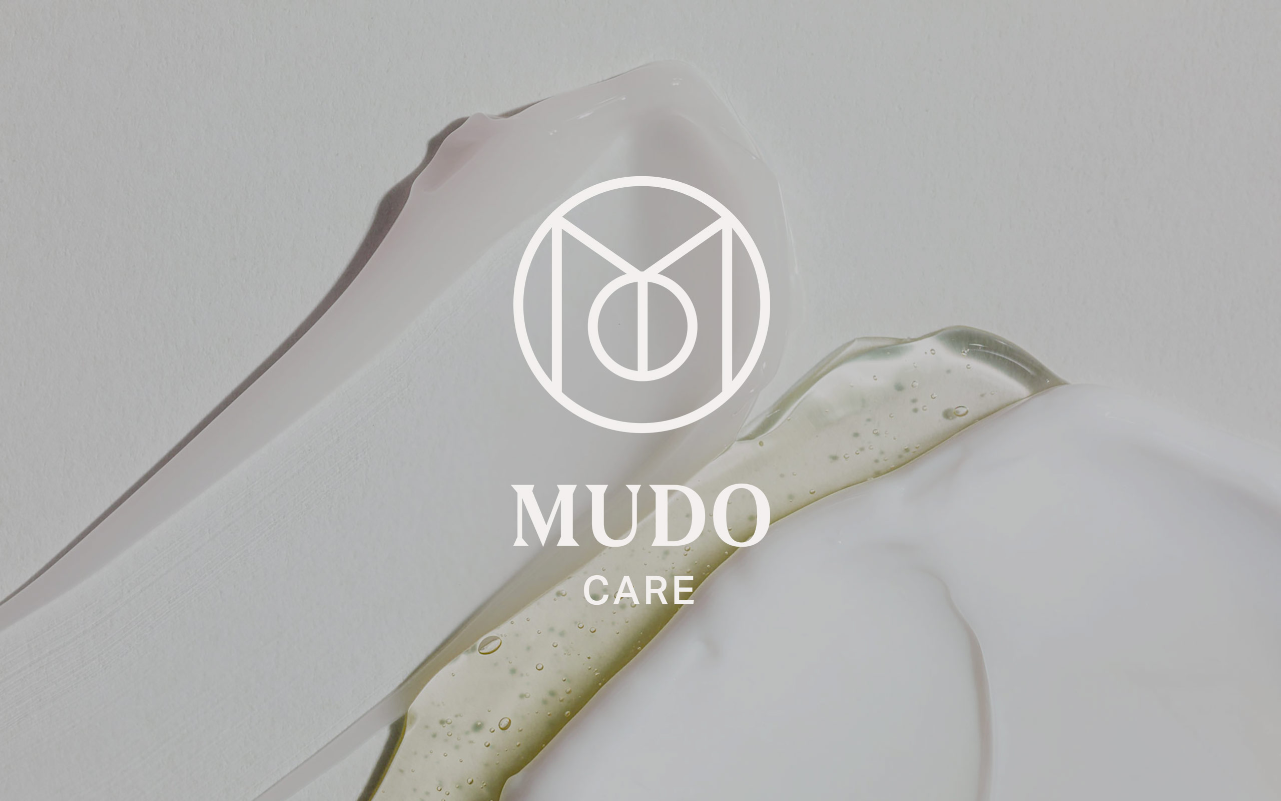
MUDOCARE is more than just a name — it carries the personal imprint of its founders, formed from the initials M-U-D-O. This fusion reflects not only a shared vision but also a sense of responsibility, care, and commitment. The logo captures this spirit: a harmonious monogram of the four letters, enclosed in a circle to symbolize unity, wholeness, and protection — values that run deep through the brand. The brand’s visual identity is intentionally subtle and earthy. Natural tones dominate the palette, mirroring the close relationship with nature, skin health, and sustainability.
The overall look is calm and grounded, conveying trust and expertise without shouting for attention. This aligns with the brand's core values: sustainable care, professional know-how, and the integrity of a family-run company.
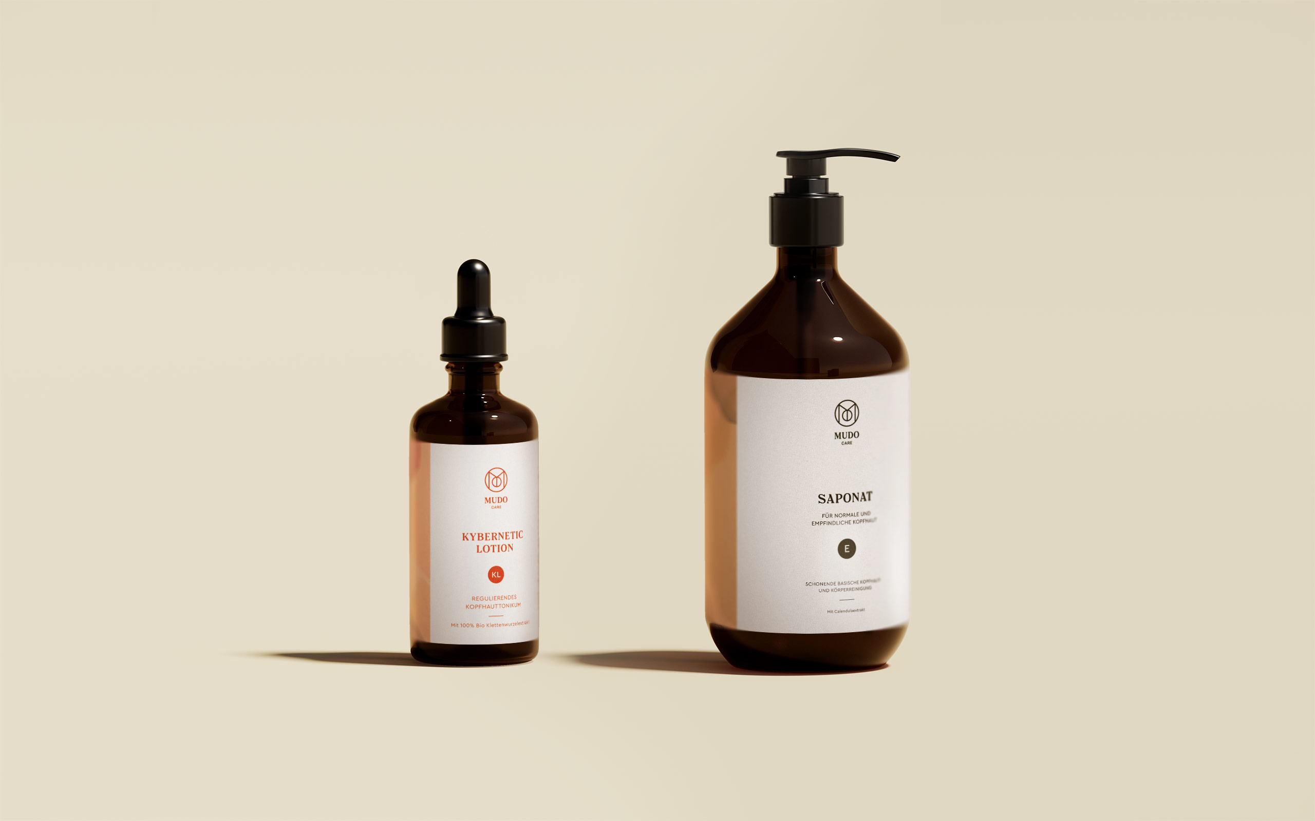
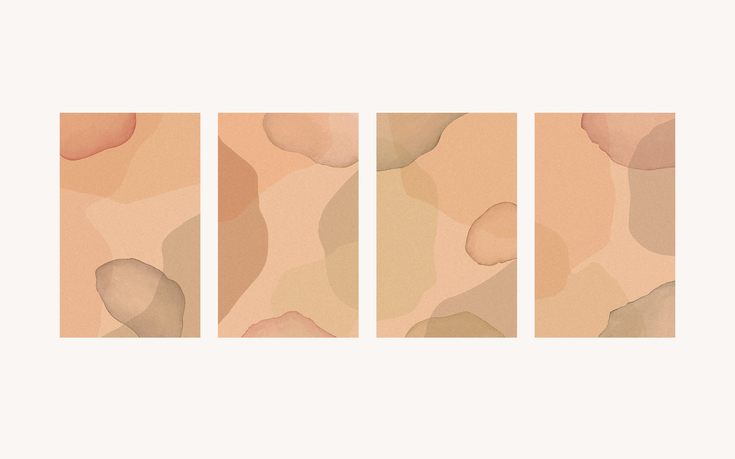
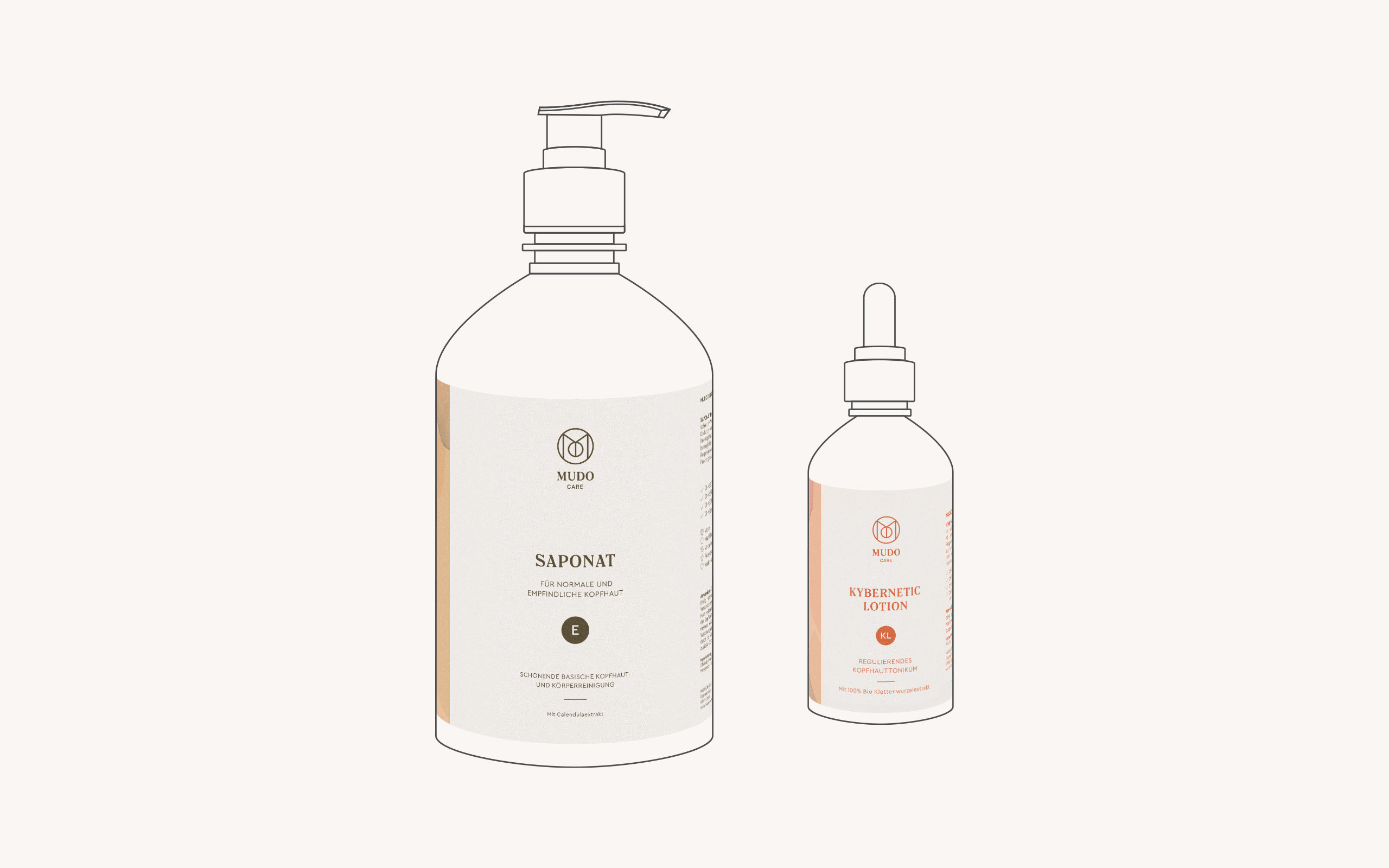
The packaging is minimalistic yet warm, using clear typography and thoughtful spacing to guide the eye — nothing distracts from what matters: the product and its purpose. Each label is complemented by an abstract, softly layered background illustration. These organic shapes evoke natural surfaces and skin tones, adding a sense of calm and tactility to the design. The visual balance between clarity and softness reflects the product’s function: supporting and restoring the scalp in a gentle yet effective way.
A soothing experience
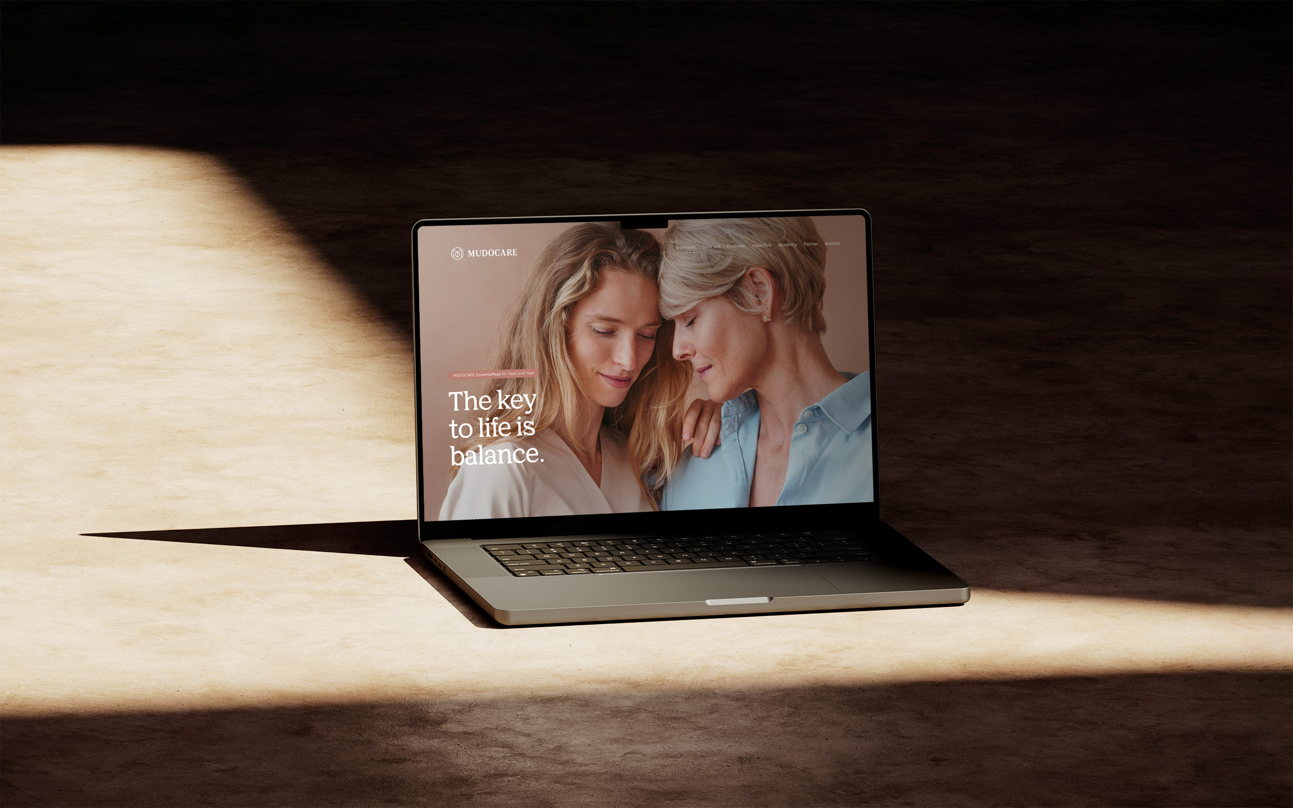
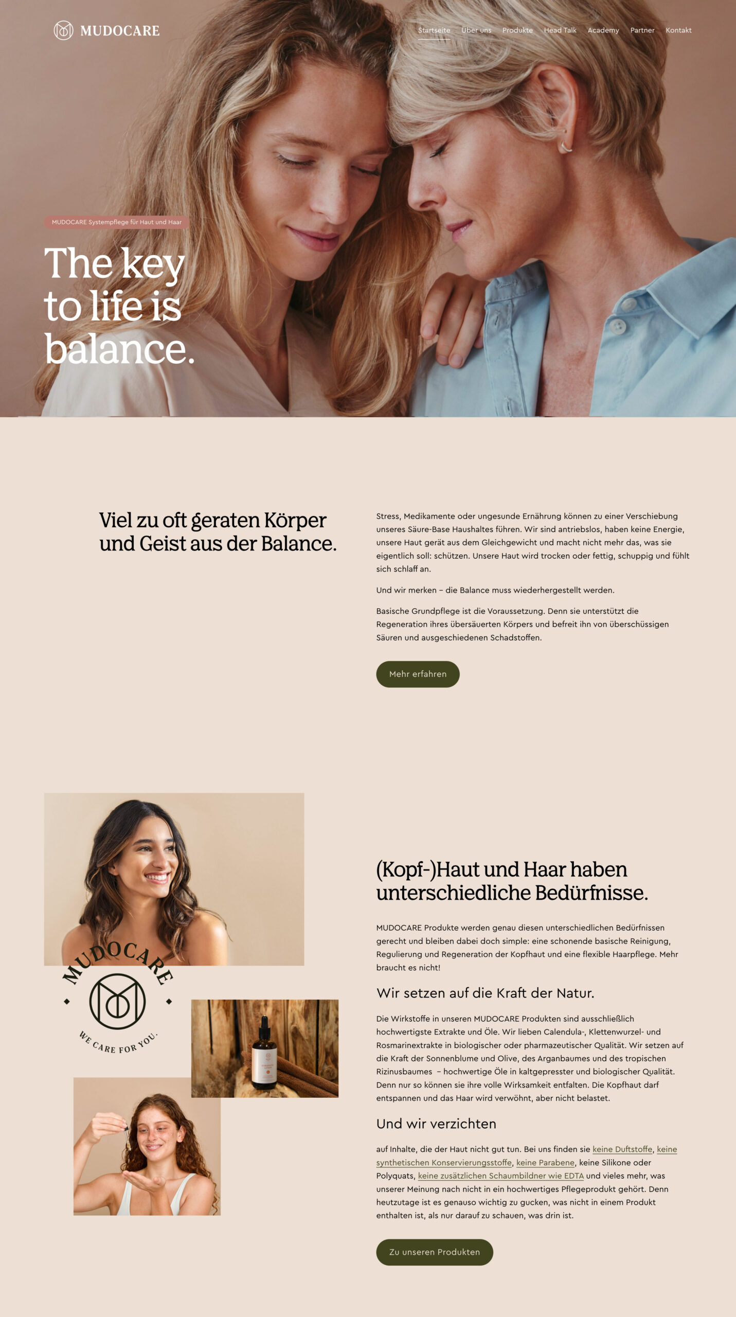
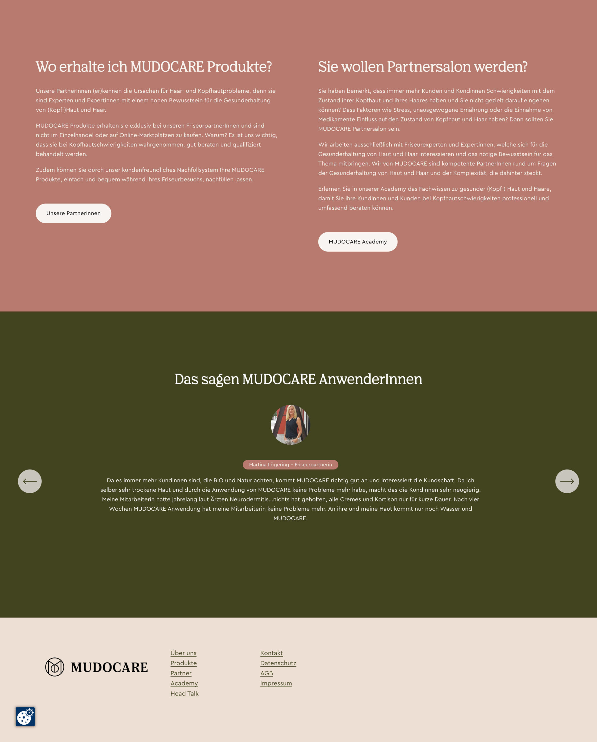
The website reflects the brand’s calm and confident approach to scalp care. With a clean, minimal design and soft, natural tones, the site creates an immediate sense of trust and clarity. The layout is intuitive and thoughtfully structured, guiding users through the product range and core benefits without overwhelming them. Carefully curated visuals and subtle interactions help convey a sense of ease and professionalism. From the first scroll, the experience feels calm, informative, and supportive — just like the brand itself. Every detail is designed to make users feel informed, cared for, and at ease as they explore solutions for their scalp health.
Other projects
